Integrations user guide
In this guide:
- Introduction
- Getting started with Desktop
- Launching applications
- The Panel
- The Publisher
- The Loader
- Advanced functionality
- Acknowledgments
Introduction
ShotGrid integrations bring ShotGrid into your content creation tools. When you use ShotGrid’s integrations, you’ll be able to easily launch your software, use the Panel to track notes and data ShotGrid has about your tasks, and use the Publisher and Loader to track files and bring them into your scene. Artists will have access to all the ShotGrid data about their Tasks, and all Tasks on their Project, from right within the app. They can reply to Notes, playback Versions, publish files, and load in their colleagues’ published files.
For the latest updates to ShotGrid integrations, please subscribe to the release notes.
Getting started with Desktop
The ShotGrid Desktop app sits at the heart of our integrations. It is a software application that extends the ShotGrid experience onto your local machine, and makes it easy to access ShotGrid data, launch applications, and run pipeline integration tools directly from your machine.
Running Toolkit Classic or a Custom Setup?
The ShotGrid Integrations install automatically. If you are an advanced client wanting to install the Classic Toolkit configuration or you have a Custom Toolkit setup that you want to install via the Desktop Setup Wizard , please head over to the administrator’s guide to learn how to do this.
Installation of Desktop
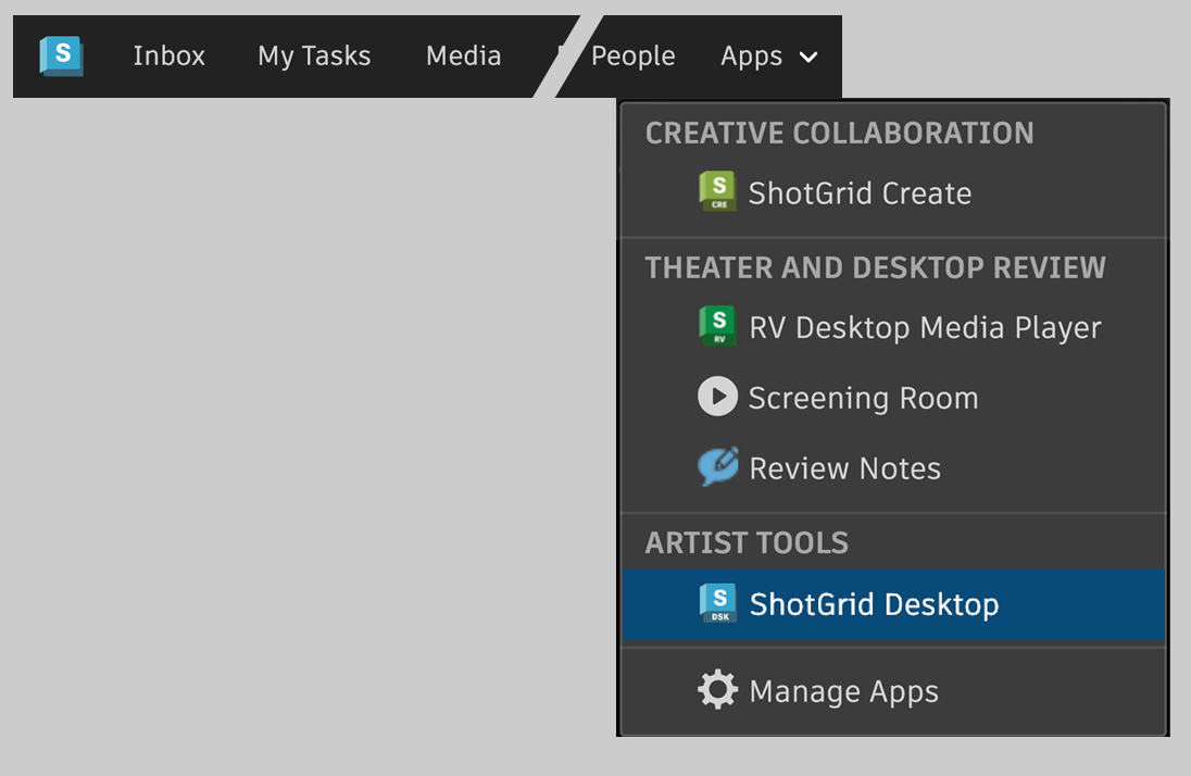
You can download ShotGrid Desktop under the Apps menu.
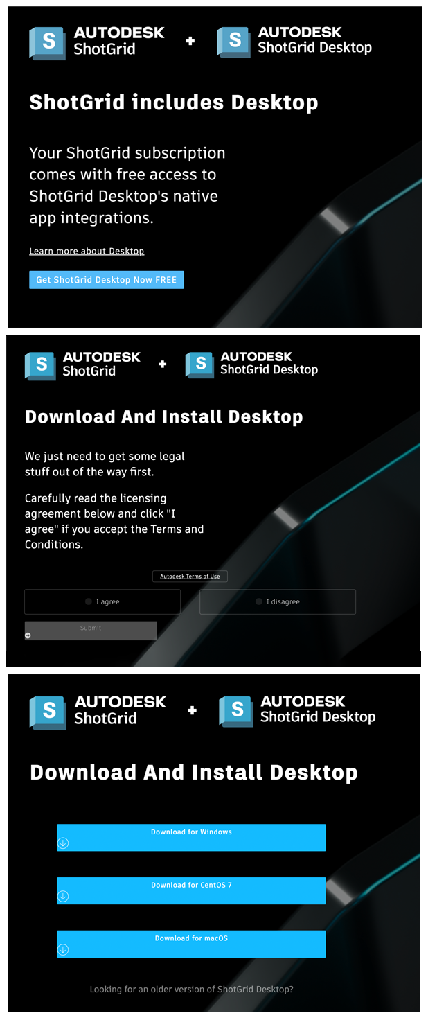
Follow the prompts and choose whether to download Desktop for Mac, Windows, or Linux.
Installing a newer version of Desktop
You can update ShotGrid Desktop on all supported operating systems without uninstalling you current version. However, ensure that you close your existing session prior to updating your ShotGrid Desktop version.
Note: on Windows, if Desktop is running while updating the version, a binary lock will interfere with the install and cause the installer to stop. This will result in an incomplete installation since some files have already been copied. To fix this, exit Desktop and select “retry”.
Logging in when self hosted or behind a proxy server
Note: the following content regarding logging in is intended if you are self hosted or using a proxy server. This is not the defaut behavior.
If you are self hosted or using a proxy server, the first time you open Desktop, you’ll be prompted by your browser about certificates. We do this in order to connect ShotGrid with the Desktop app. If you’re having trouble getting certificates set up, take a look at our troubleshooting docs for Firefox and Chrome and other browsers .
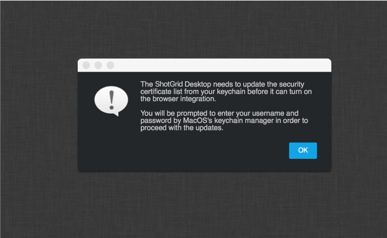
You will only need to update your security certificate list once. Please note that only Mac and Windows show a prompt for certificates, not Linux.
Once that’s set up, you’ll need to log in to your ShotGrid site.
If you go through a proxy, you will have to do some additional configuration. See instructions on how to do that in our Admin Guide .
Authentication and browser integration
Desktop provides services that allow the ShotGrid web application to interact with your computer. This enables features like local file linking and software launching. For security reasons, you must be logged into Desktop as the same user on the same ShotGrid site as you are in the browser. If you are logged in as a different user or on a different site, Desktop will prompt you to switch accounts and if you do it will restart and prompt for the appropriate credentials.
The system tray
When the application starts it shows up as an icon in your system tray. To show the window, click the icon. By default, the window will be pinned to the system tray, which means that if the window loses focus, it will automatically hide itself.
You can unpin the window by selecting “Undock from Menu” from the user menu or by dragging it by its header. When the window is unpinned it will look like a regular window and will no longer hide itself when it loses focus.
While the window is undocked, you can hide it by clicking on the close button. To show it again, click on the system tray icon.
The project browser
The first main view of the app is the project browser. Here you will see all the projects in your ShotGrid instance. Your most recently accessed projects will be listed first.
Near the bottom right of the window you will see your ShotGrid account’s thumbnail. This is the user menu, where you can do things like dock and undock the window, keep it on top of other windows, and show the logging console.
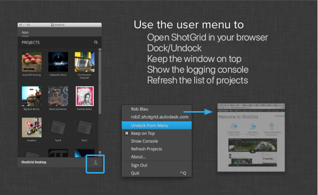
At the top of the window, you can click on the magnifying glass icon to show the search box. Typing in this box will filter the list of projects shown to just those that contain the letters you are typing.
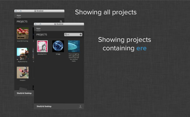
Clicking on a project will take you to the command launcher view for that project, where you can launch the tools that are available for the project.
The command launcher
Once you have selected a project, you are taken to the command launcher for that project. This window will show whatever tools and applications are available for the project as a grid of buttons. Simply click on a button to launch its application. It will run in a project-specific environment, and if ShotGrid has an integration for it, you’ll see a ShotGrid menu with all of the available tools.
The console
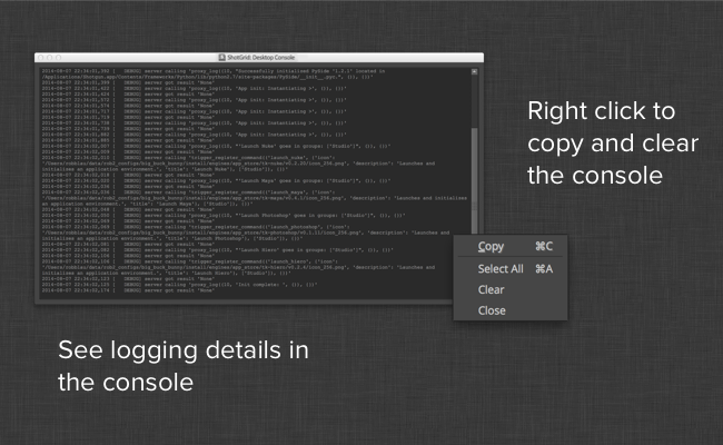
You can launch the console from the user menu. The logs from launching a project are displayed here. If you run into an error, the details of the error should be shown here.
If you right-click on the console, you are given a standard edit menu, allowing you to select all of the text, copy your selection, or to clear the text in the console.
Launching applications
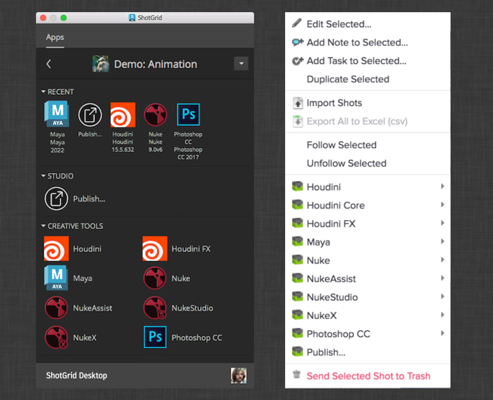
When you launch ShotGrid Desktop and choose a project, it scans the standard applications directory for your operating system. Desktop will display launchers for any applications that we have integrations for . If you have more than one version of the same software, the launcher will have a dropdown list with all available versions. Clicking on the launcher icon itself will launch the latest version.
You can launch applications like Maya and Nuke straight from ShotGrid Desktop, or you can launch them directly from ShotGrid. Either way, ShotGrid’s integrations will be available from within your application.
It’s normal for a studio to need additional configuration other than what comes out-of-the-box. Your studio may have software in a non-standard location or in-house engines for software we don’t support natively. It’s easy to configure these cases from right within the ShotGrid web app. See the Admin Guide for details.
If you’re not seeing an app you expect to see, take a look at the Configuring the software in ShotGrid Desktop section of our Admin Guide .
The Panel
Overview
Upon launching an application from Desktop or ShotGrid, the ShotGrid Panel will appear. The ShotGrid Panel is a small and lightweight version of ShotGrid which runs directly inside artist applications such as Maya and Nuke. The Panel lets you quickly access ShotGrid information without leaving the application you’re working in. It provides easy access to information about your current task, and you have instant access to the activity stream, Notes, Tasks, Versions, and Publishes from ShotGrid. You can play back Versions sent to review by other members of your team, reply to Notes, create new Tasks, and search your ShotGrid site.
UI details
The ShotGrid panel consists of a couple of main UI elements. On top you’ll find a toolbar with buttons for navigation and searching. Right below the toolbar you have the details area which displays information about the item you are currently viewing. This details area is configurable, so if you want to display custom fields or have data that is extra important in your pipeline, it is easy to make it appear here. Lastly, you find a number of Content tabs . These all display listings of ShotGrid data and make it easy to navigate around in the ShotGrid Panel to quickly browse things like publishes, review Versions, or see who is assigned to the Tasks linked to your current focus.
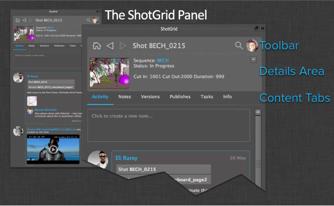
In applications where the integration supports docking, the ShotGrid Panel will appear seamlessly docked inside the UI. In other applications, it will be displayed as a normal window.
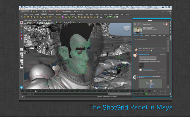
Below is a brief overview of the different tabs and features available in the ShotGrid Panel.
The activity stream
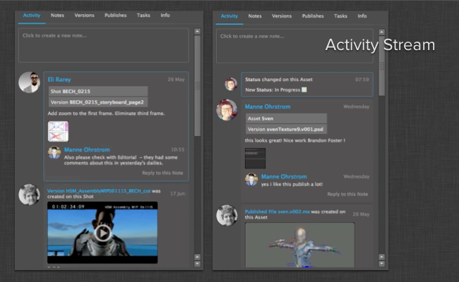
The activity stream works just like the activity stream in ShotGrid—it shows you all the things happening in and around the object you are looking at:
- users creating Notes,
- Versions being submitted for review, and
- publishes being created by the pipeline.
You can add new Notes directly from the activity stream and also reply to existing Notes. Attachments will show up automatically, and clicking them will show a large preview.
Please note that after uploading a file, you may see a placeholder icon. Manually refresh the panel to display the final thumbnail, once it becomes available.

Creating and replying to Notes
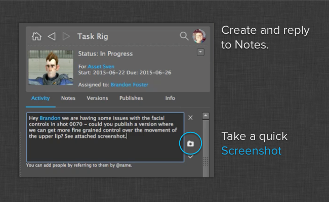
Creating or replying to a Note is easy with the ShotGrid Panel. Simply navigate to an activity stream or Note details page and click either create note or reply to note . A dialog will appear where you can type in the Note text. You can use @name notation if you want to send the Note to a specific person—this will add that person to the TO field of the Note automatically.
Notes, Versions, Publishes, and Tasks
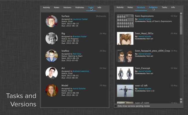
The Notes, Versions, publishes, and Tasks tabs all work the same way—by displaying data associated with the current item you are seeing. You can double click an item to focus on that item. Once you have navigated to a Publish , you can view the dependencies for that publish. This is useful if your pipeline is tracking dependency information and gives you instant access to how your assets are interconnected.
The info tab
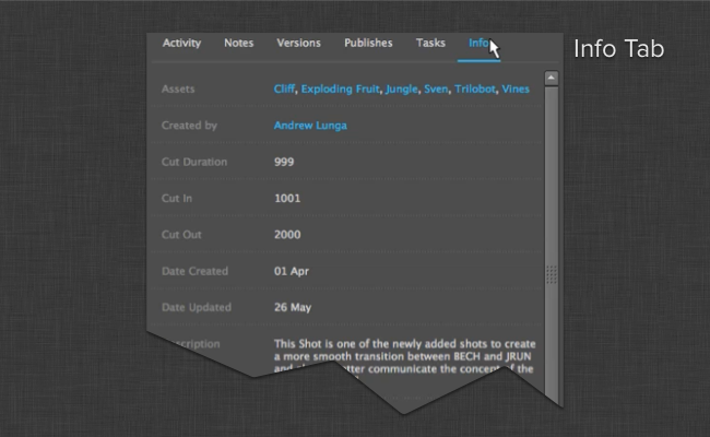
If you cannot find what you are looking for in the other tabs, try navigating to the info tab. This holds most of the ShotGrid fields for your focused entity and you can click on the blue hyperlinks in order to navigate around to other ShotGrid locations.
Searching
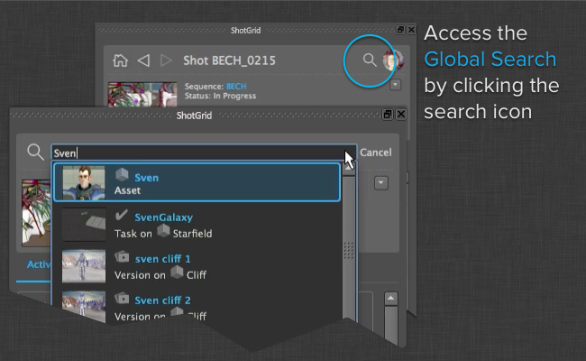
If you want to quickly navigate to another location or object in ShotGrid, you can use the built-in search. This is similar to the global search in the ShotGrid web application. Just start typing the name or description of what you are looking for. Once you have typed in three or more characters, you will see results displayed.
Actions
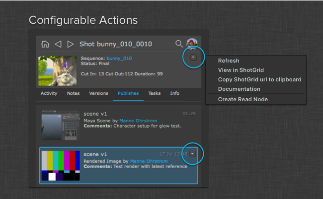
You can also use the ShotGrid Panel to use ShotGrid data to run operations in your scene. Similar to the Loader, the Panel has an actions system that makes it easy to register snippets of code to be triggered by a menu on an item in the browser. You can access actions from the detail area as well as from the listings. The actions button in the details area also contains some handy built-in functions to quickly jump to ShotGrid and to refresh your current view.
The current work area and the me area
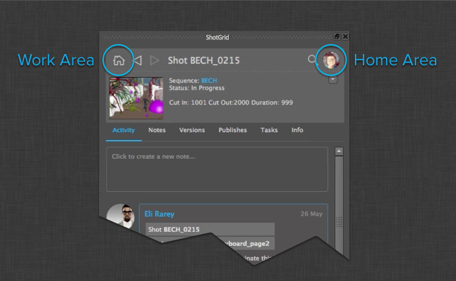
The icon on the top left navigates you to your current work area. This is typically the Task that you are currently working on and is a quick way to get access to Notes, and review Versions and other information relevant to what you are currently working on. This is also the location that the ShotGrid Panel always starts focused on.
On the top right you will find a button displaying the current user’s thumbnail. This button will take you to a page which displays information associated with the current user. This includes
- All the publishes and Versions you have submitted
- Tasks that are assigned to you
- All note conversations where you are either participating or where the Note is relevant to you—e.g., Notes that are associated with Tasks that you are assigned to.
Current Work Area
When you start working on a Task, you can use the Panel to set your Current Work Area. Then, when you publish your work, it will be associated with your current Task in ShotGrid.
The Publisher
Overview
The Publish app allows artists to publish their work so that it can be used by artists downstream. It supports traditional publishing workflows within the artist’s content creation software as well as stand-alone publishing of any file on disk. When working in content creation software and using the basic ShotGrid integration, the app will automatically discover and display items for the artist to publish. For more sophisticated production needs, studios can write custom publish plugins to drive artist workflows.
The following sections cover the publisher UI and basic integration workflows. For information about customizing the publisher for your studio-specific needs, please see the Publisher Dev Guide .
Interface components and concepts
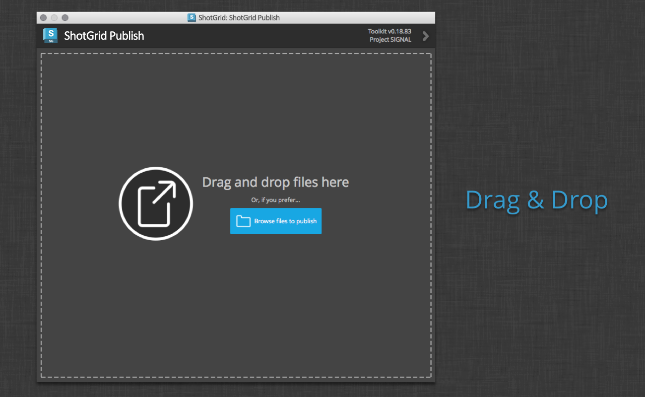
Drag and drop files from anywhere on your local filesystem. Use the browse button to open a file browser to select one or more files to publish.
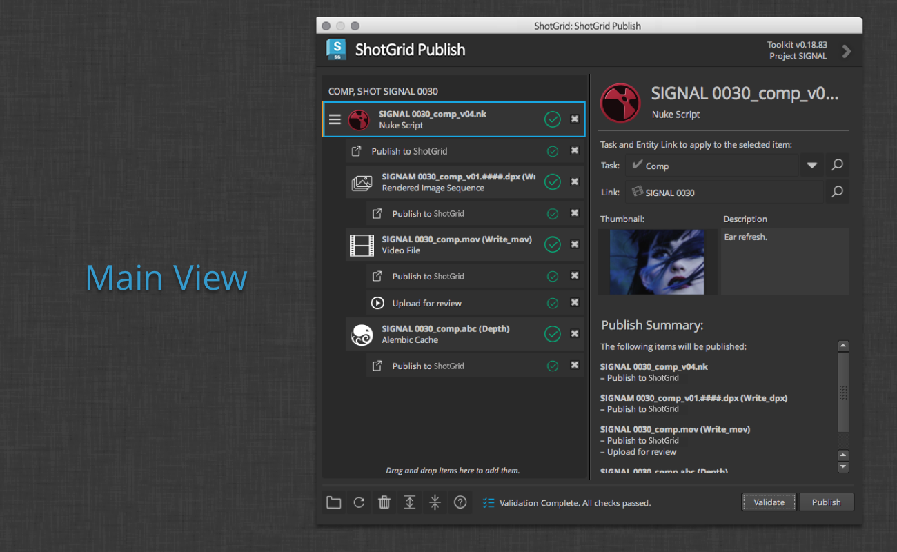
The tree of items on the left show what will be published. The top level items can include subitems that are related, such as renders or caches generated from within the work file. Under each item is one or more publish tasks, which represent the actions to be performed at publish time.
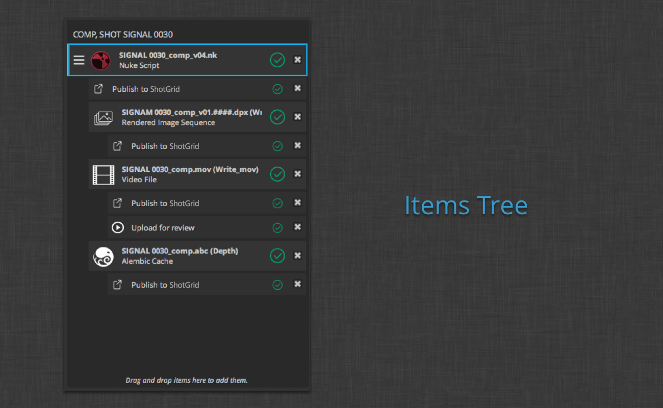
Items themselves are grouped under context headers that indicate the ShotGrid context that the published file will be associated with.
When there is more than one top-level item, a summary item will be present which provides an overall look at the items to publish and actions that will be executed.
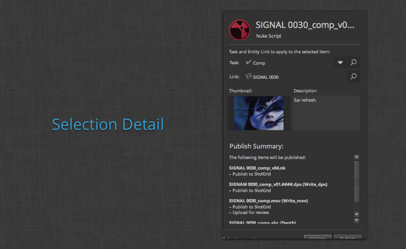
When an item is selected, the right side of the interface will show the item’s details. This includes the destination context as well as a thumbnail and description for the publish. A summary will also be included for the item and any subitems.
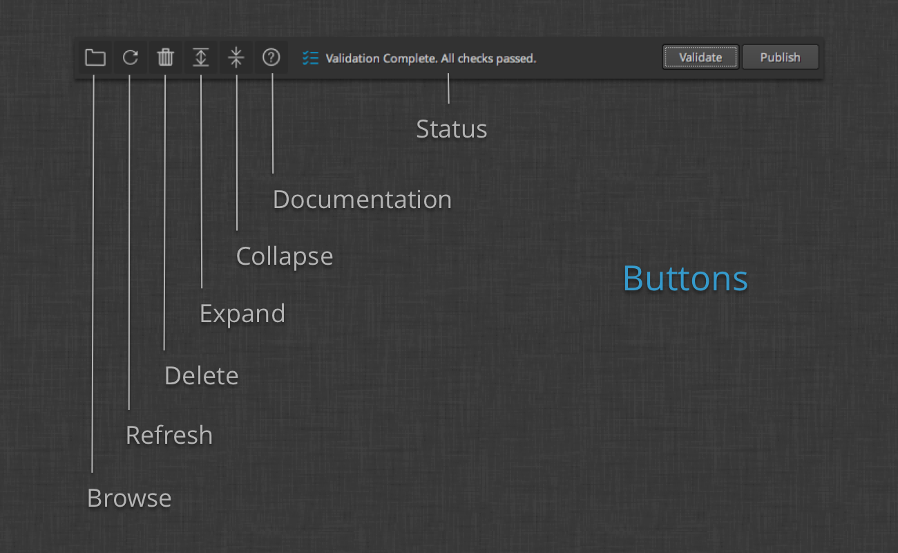
At the bottom of the interface, there are a series of tool buttons on the left. These buttons are:
- Browse : Browse for files to publish
- Refresh : Refresh the publish item list
- Delete : Remove the selected items from the list
- Expand : Expand all items in the list
- Collapse : Collapse all items in the list
- Documentation : Open the workflow documentation
In the middle is a status label. This will update as the Publisher performs validation and executes the publish tasks. When clicked, you will see the progress detail overlay.
To the far right are the Validate and Publish buttons. The Validate button will execute an initial validation pass on all items and tasks to ensure they are in a publishable state. The Publish button will initiate the publishing of items in the list.
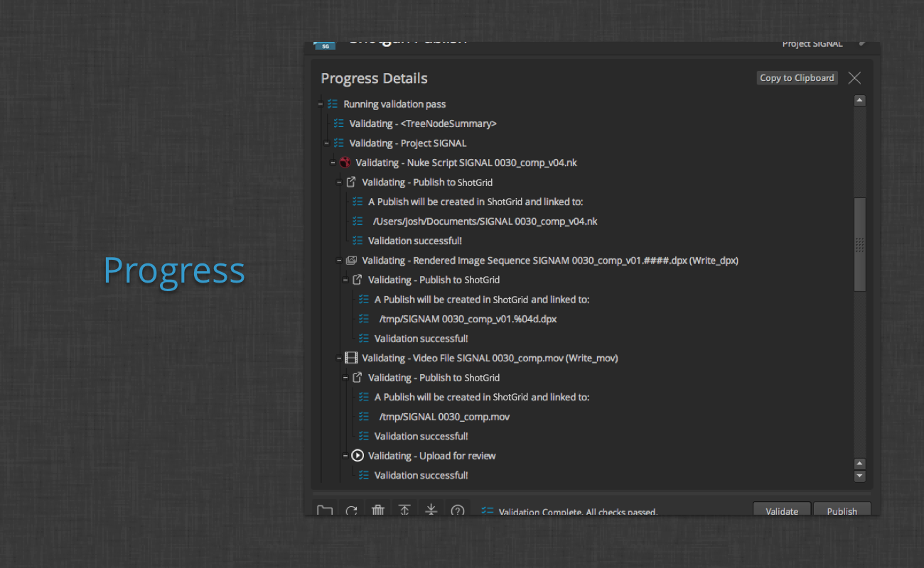
The progress details overlay shows the output of collection, validation, and publishing of items in the list.
A Copy to Clipboard button makes it easy for users to share publish logs. When validation or publish errors occur, the log messages may include an action button that will guide the user toward additional information and, in some cases, an immediate fix.
Basic workflow
The purpose of the Publish app is to allow an artist to make their work available for other artists to use. In ShotGrid, publishing a file means creating a record in ShotGrid with information about the file being published, including the path, version number, artist info, related ShotGrid context, etc. Once the file is tracked in ShotGrid, other users can make use of it via the Loader app.
The basic ShotGrid integration provides two ways to use the Publish app in your pipeline: standalone publishing and publishing within content creation software. The following sections outline the workflows for each of these scenarios.
Publishing within content creation software
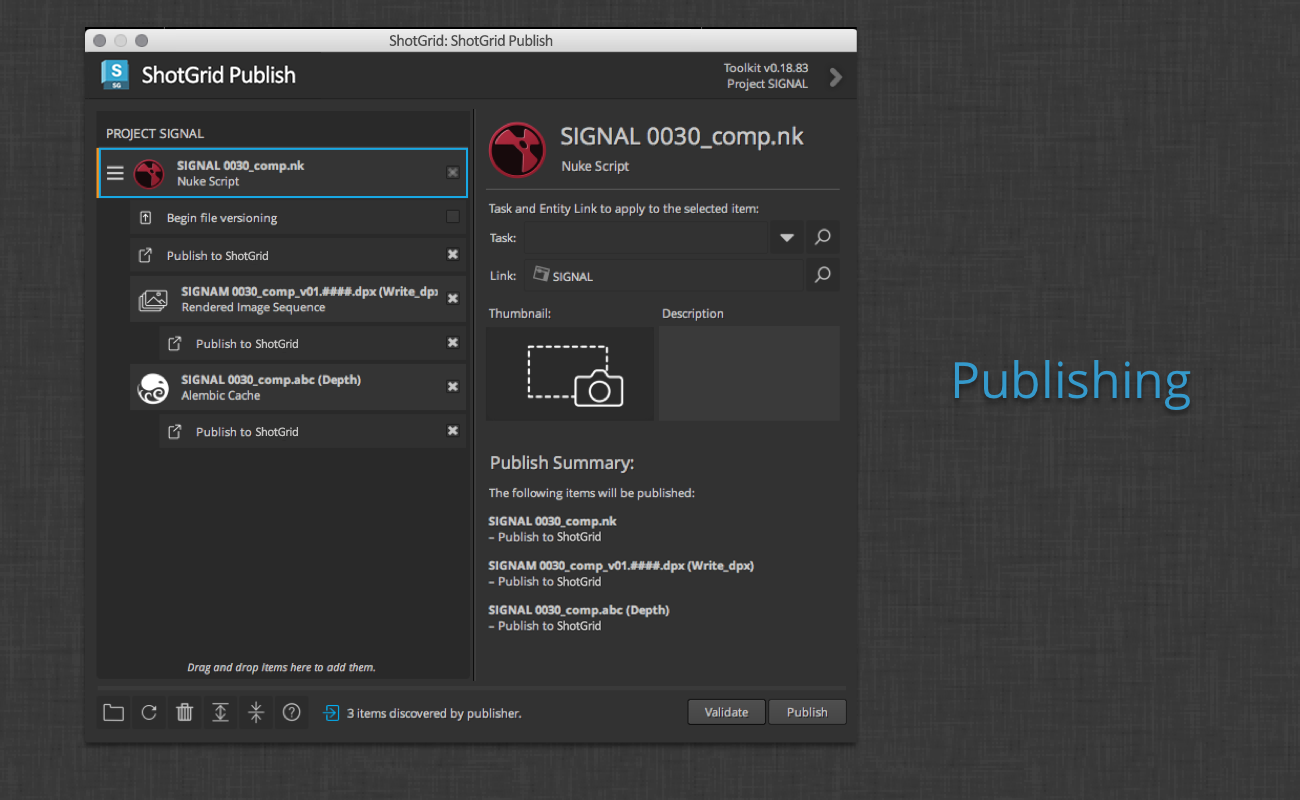
The basic ShotGrid integrations include publishing workflow support for content creation software including 3dsMax, Houdini, Maya, Nuke, Nuke Studio, and Photoshop. When the Publisher is launched with the content creation software, it will automatically attempt to find items to publish. While the items that are presented for publishing will differ slightly based on the software and the contents of the artist’s work file, the same basic publish concepts apply. Here is an example of publishing within Nuke:
Publish items and tasks
Here you can see the publish items that have been collected on the left hand side. There are three publish items: the selected item is the work file itself with two child items below it. Additionally, there is an image file sequence and an Alembic cache. These items each have a Publish to ShotGrid publish task attached that, when executed, will handle creating the publish entry in ShotGrid in order to keep track of the individual files or image sequences.
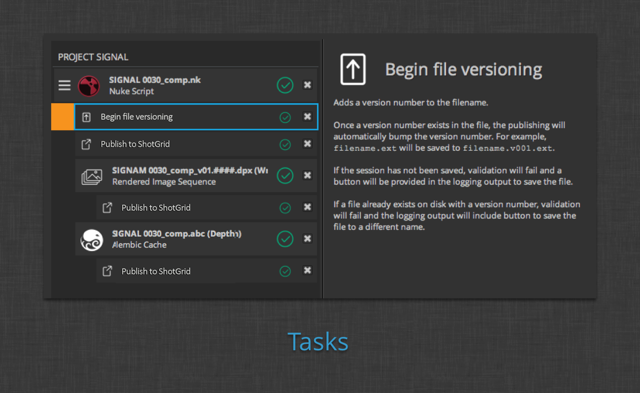
The parent item representing the Nuke Script has a Begin file versioning plugin attached. This plugin will appear when the work file does not have a version number in the path. If checked, this task will insert a version number into the file name prior to publishing. In this case, the file would be renamed from bunny_010_0010.nk to bunny_010_0010.v001.nk . This encourages keeping a history of the artist work file. The task is not checked by default and is not required to run. If the item is published with the task enabled, the next time the work file is published, since it will have a version number in the file name, the task will not show up.
The publish tasks can be turned on or off as desired. The check box on an item reflects and controls the check state of its subtasks. For example, unchecking an item will uncheck all of its tasks. Unchecking one of multiple tasks will put the item into a semi-checked state. To toggle the check state of all tasks of a certain type (all Publish to ShotGrid tasks for example), simply hold the Shift key when checking the box.
Selecting a publish task will show information about what the task does.
Context
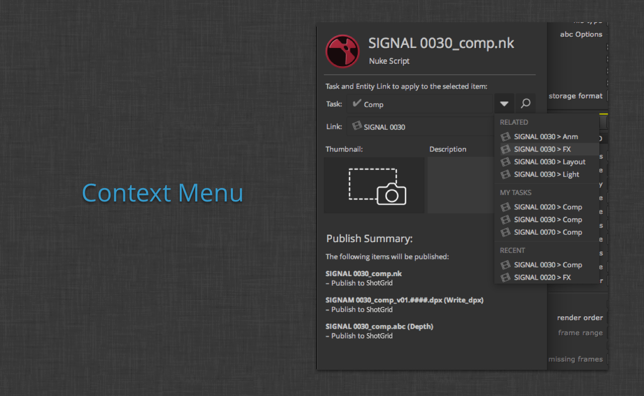
Above the Nuke Script item, you can see the name of the context that the published items will be associated with in ShotGrid. This can be modified by changing the Task and/or Link fields on the right side of the interface. If multiple items are being published, they may show up under different contexts. The icon with three horizontal lines on the left of the publish items is a drag handle for moving items from one context to another.
A menu dropdown button is also provided next to the Task entry field. This menu can show several groups of Tasks that you might be interested in. It will show any tasks assigned to the current user, tasks related to the current context (such as other tasks assigned to the same Shot), and any recently browsed tasks.
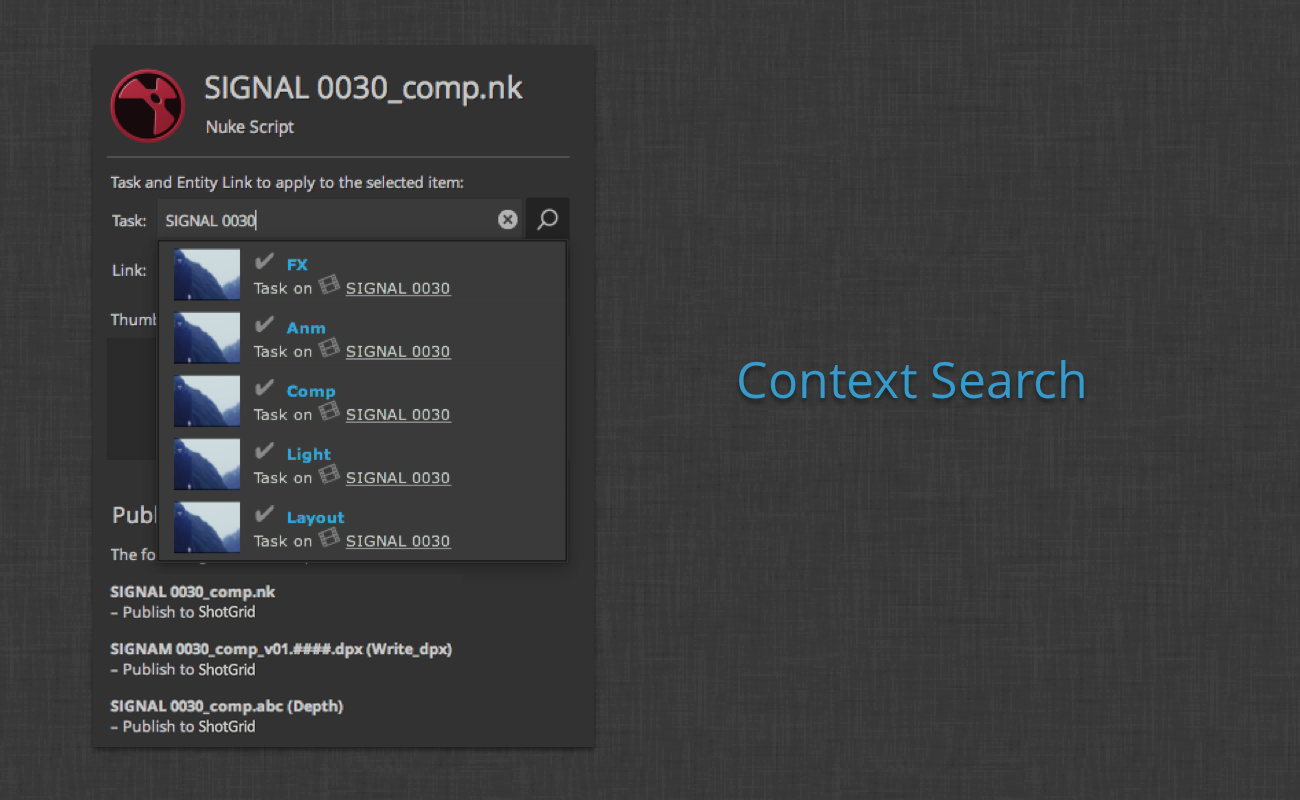
To search for a task or entity link, simply click on one of the fields or click the search icon and begin typing the name of the context you’re interested in. The fields will show matching tasks or entity links and you can click or navigate to the desired context.
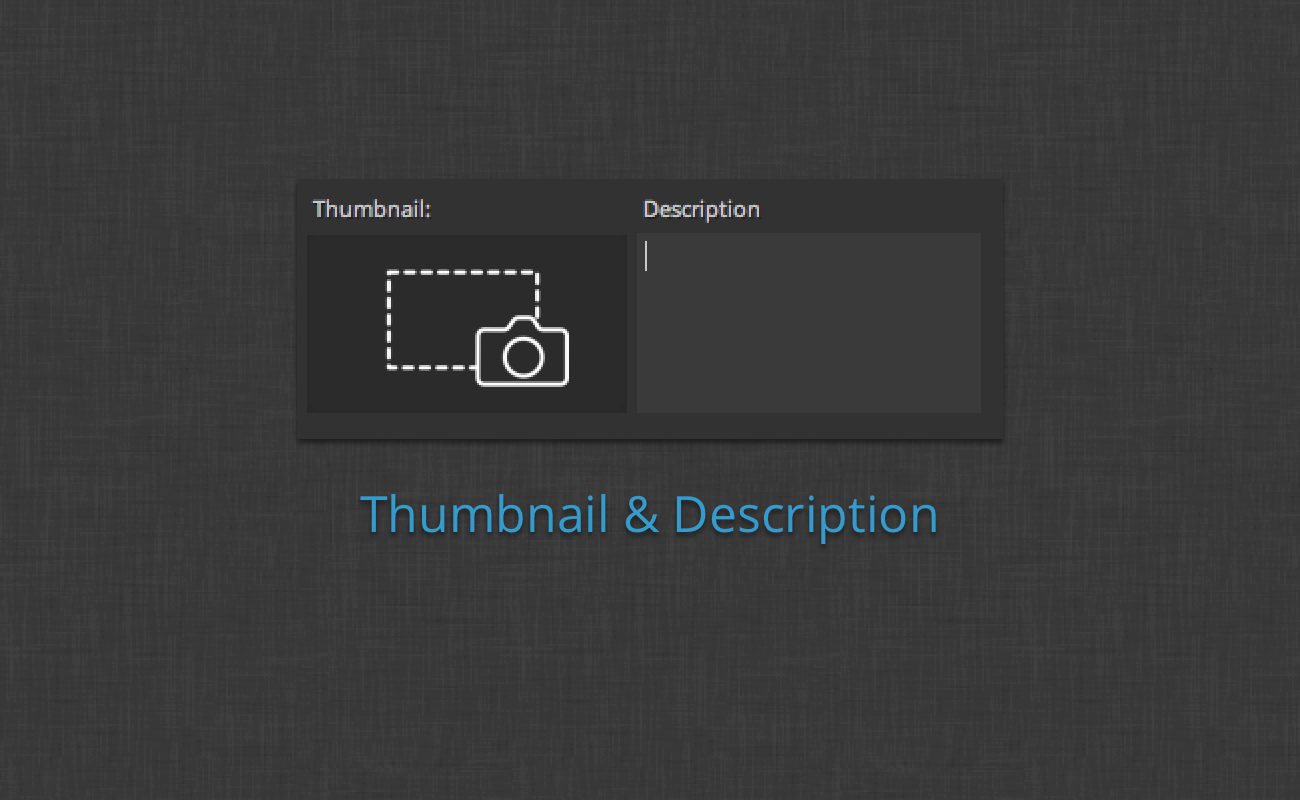
For each publish item, you can click the camera icon to select a portion of the screen to use as the thumbnail for the Publish in ShotGrid. For scenarios where there are child items, they will inherit the thumbnail from the parent by default. You can override the child item’s thumbnail by selecting the child and clicking its thumbnail.
The description entered will be included in the Publish data in ShotGrid. Like the thumbnail, the description is inherited from parent items but can be overridden by entering a new description in the child’s detail entry.
Validation
Once the items are ready to be published, you can click the Validate button to ensure the state of the file and the publish items will allow the publish to complete as expected.
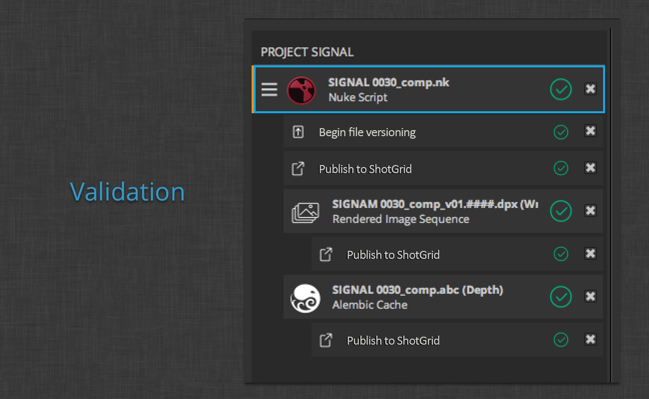
If all items validate properly, you should see green checkmarks on the right. For any items that do not validate, you will see a warning icon.
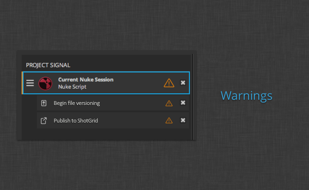
The status will also be displayed in the status label area at the bottom of the publisher.
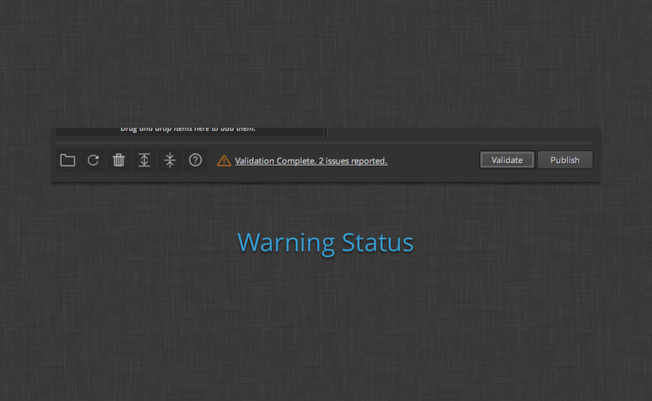
Clicking on the icon in the item or the status label will open the progress details overlay and highlight the validation issue.
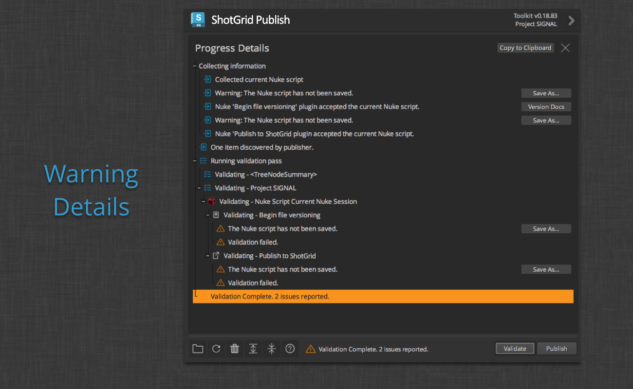
In the example above, the Nuke script has not been saved. In some scenarios, an action button will be provided to quickly direct you to the fix for the issue or to get more information about the issue. Here you can see a Save As… action button that will open the Nuke save dialog.
Once the validation issues have been corrected, you can close the progress details overlay to return to the publish item view. Validation can be run as many times as required while addressing publish task warnings or errors.
When the Publish button is pushed, the app will walk through the items and tasks in the list, run another validation pass on each, and then execute the publish logic to create entries in ShotGrid, upload thumbnails, bump the work file version, etc. A finalize pass is also executed to summarize publish for each item and do any cleanup work necessary.
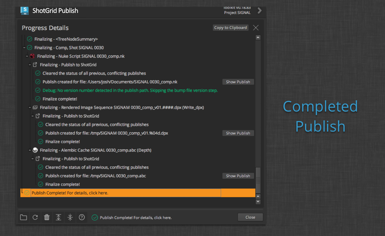
The results of the entire process can be reviewed afterward by clicking the status label at the bottom of the publisher to show the progress details overlay. You can also leave the progress details view on while publishing to see the output as the publish occurs. You can see additional action buttons, shown here, to quickly jump to the newly created publish entry in ShotGrid.
Multi-document workflows
For multi-document workflows in content creation software such as Photoshop or Nuke Studio, multiple top-level items will be displayed in the publish item list.
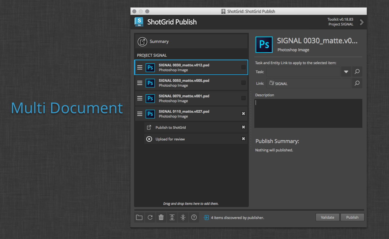
Only the current/active document will be expanded and checked. To check all documents to publish, simply hold Shift and click one of the unchecked item’s check box. To expand the collapsed items, use the expand button in the toolbar at the bottom.
When there are multiple top-level items, a summary item is also included at the top of the list.
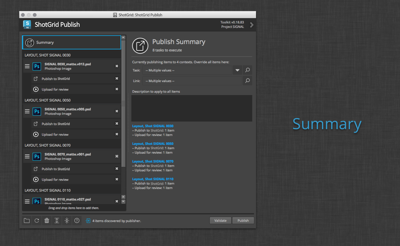
Selecting this item will show a complete summary of all items selected for publishing. Above you can see four items with a total of eight tasks to execute in four different contexts. You can override the context and description for all items in this view if you desire.
You can also see an Upload for review task in the image above. This task is not limited to the Photoshop workflow. It will be available for any file type that can be transcoded and uploaded to ShotGrid as reviewable media.
Stand-alone publishing
The Publish app is not required to be run from within content creation software.
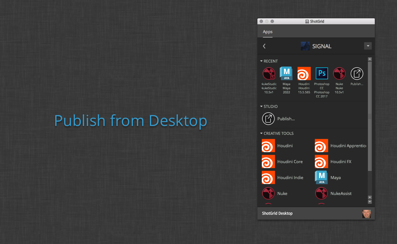
Here you can see the publisher can be launched directly from ShotGrid Desktop. When launched in standalone mode, you will be presented with an area to browse or drag and drop files.

Clicking the browse button will open a standard file browser where you can select the files you would like to publish.
Once you have selected files from the browser or dragged and dropped them from somewhere on your file system, the app will show them as top-level items for publish.
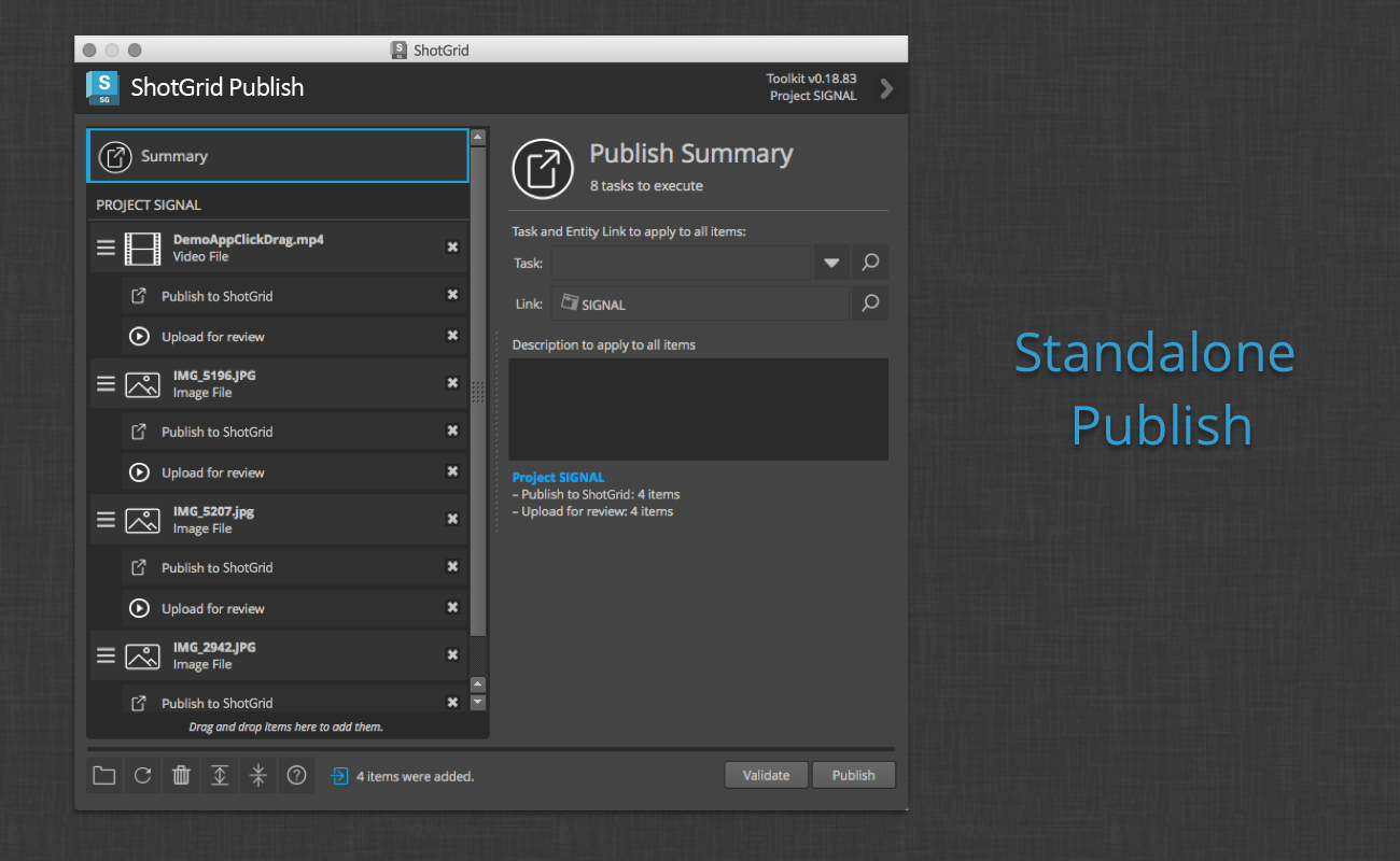
As with the previous examples, you can select the context for each item, set the description, and identify which task should execute when publishing.
Publish types
The following sections describe the automatically collected publish types for each of the basic ShotGrid integrations.
Standalone
The standalone workflow does not automatically collect files for publishing. Users must drag file paths into the interface or browse to them in order to publish. The publisher will accept browsed or dropped files at any point prior to the Publish button being clicked. The basic integration will accept any file extension using known file types to associate with ShotGrid publish types. If the file extension is not recognized, the mimetype of the file will be used. Recognized image and video mimetypes will be publishable and have a task attached to upload for review.
The basic integration assumes that folders dropped contain image sequences. Any recognized image sequences found in the folder will be presented as items for publishing. If no sequences are found, no items will be created for publish.
3ds Max
The current Max session will be collected for publishing with a publish type of 3dsmax Scene which can be merged or referenced into another Max session via the Loader.
If a project folder can be determined for the current session, any files found in the project’s export folder will be presented for publish. Similarly, any movie files found in the project’s preview folder will be publishable.
Houdini
The current Houdini session will be collected for publishing with a publish type of Houdini Scene which can be merged into another Houdini session via the Loader.
Any files written to disk from nodes of the following types will also be automatically collected and presented as publish items:
- alembic
- comp
- ifd
- opengl
- wren
Maya
The current Maya session will be collected for publishing with a publish type of Maya Scene which can be imported or referenced into another Maya session via the Loader.
If a project root can be determined for the current session, any Alembic files found in the project’s cache/Alembic folder will be presented for publish. Similarly, any movie files found in the project’s movies folder will be publishable.
Nuke
The current Nuke session will be collected for publishing with a publish type of Nuke Script which can be imported into another Nuke session or opened as a new session via the Loader.
Any files written to disk from nodes of the following types will also be automatically collected presented as publish items:
- Write
- WriteGeo
Nuke Studio
Any open Nuke Studio projects will be collected for publishing with a publish type of NukeStudio Project which can be opened as a new project via the Loader in another Nuke Studio session.
Photoshop CC
Any open Photoshop documents will be collected for publishing with a publish type of Photoshop Image which can be loaded as a new layer or opened as a new document via the Loader in another Photoshop session.
The Loader
The ShotGrid Loader lets you quickly overview and browse the files that you have published to ShotGrid. A searchable tree view navigation system makes it easy to quickly get to the Task, Shot or Asset that you are looking for and once there, the Loader shows a thumbnail based overview of all the publishes for that item. Through configurable hooks you can then easily reference or import a publish into your current scene.
Publishes are records in ShotGrid, each representing a file on disk or a sequence of files (like a sequence of images, for example). Publishes can be created by any application, but are typically created by the Publisher.
Once the publishes have been created, they can be loaded in by other people in the pipeline. This is where the loader comes in. The loader will let you browse the publishes stored inside ShotGrid in a way which is reminiscent of a file system browser.
Overview
The Loader app lets you quickly browse files that have been published to ShotGrid. The app has a searchable tree view navigation system that makes it easy to see a thumbnail of a Task, Shot, or Asset.
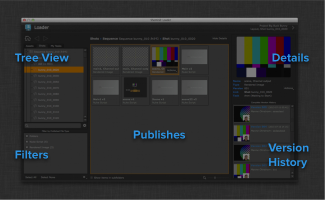
The tree view
Use the tree view on the left to quickly locate the Shot, Asset, or Task that you are looking for. If you know the name of the item you are looking for, you can type it into the search area and only items matching your search phrase will be shown in the tree.
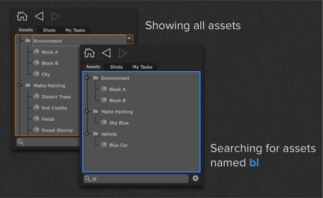
As soon as you start typing, a blue bar will be shown around the tree, indicating that you are no longer viewing the full tree, but a subset of the items in the tree, based on your search phrase. All nodes in the tree will be automatically expanded as you start searching. For convenience, if you right click the tree, you’ll find options to expand or collapse all nodes in the tree.
Navigation
On top of the tree view, you’ll find three navigation buttons.
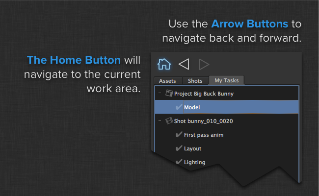
If you click the home button, the loader will automatically navigate to the Shot or Asset representing your current work area. This is handy if you want to quickly load something that relates to the work you are currently doing. On startup, this is also the location the Loader will show by default. When you select different items in the tree view, a history is built up over time. This can be navigated using the back and forward buttons, just like a browser.
Looking at publishes
Once you select an item in the tree, the available publishes will be shown in the publish area in the middle of the UI. Each item in this view represents the most recent item in a stream of publishes, so you may for example see version 15 of a texture, meaning that there are 14 previous versions in the version history for that item.
In addition to publishes, you will also see folder icons representing Shots, Sequences, Assets or other ShotGrid entity types. If there is a thumbnail for an object, you will see it overlaid on top of the folder to make navigation quick and visual. Double clicking on a folder will navigate down into that folder in the hierarchy.
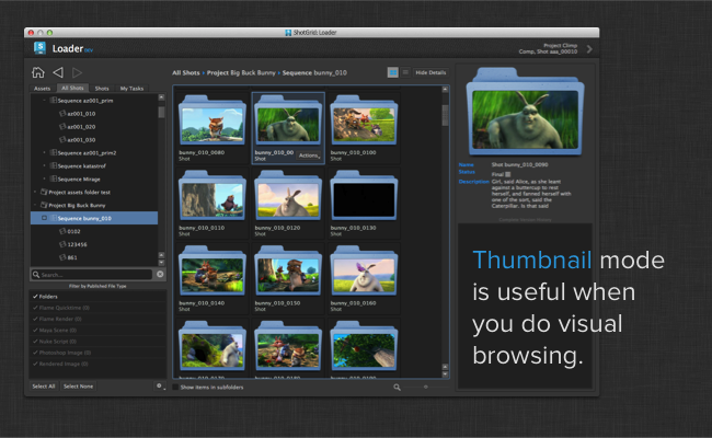
There are two viewing modes. The thumbnail mode is great when you are visually browsing, for example looking for a texture. You can quickly eyeball the list and use the zoom handle to zoom in and out quickly.
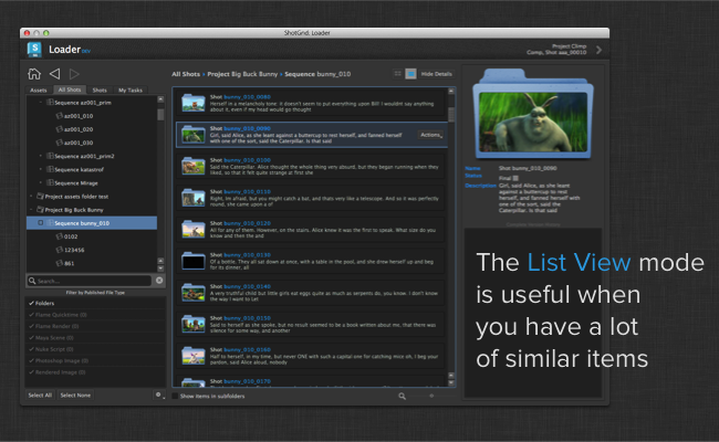
If you are browsing something less visual than textures, for example Nuke scripts or Maya files, you can use the list view instead of the thumbnail view. This mode provides you with some more information and is also more compact, allowing you to quickly scroll through lots of items.
If you only want to view items of a certain type, you can use the filter panel on the bottom left to quickly hide or show publishes. You’ll also see a summary next to each type in the list, indicating how many publishes of each type was found for the currently selected tree item.
Bringing one or multiple publishes into your scene
If you want to bring an item into your scene, simply double click it and the Loader will execute the default action for the publish. There may be more than one way to add an item to your scene (for example in Maya you may want to either reference or import another Maya file into your scene). In this case, click the actions dropdown menu or right click anywhere on the publish to see all available options.
If you want to bring multiple items into your scene, select multiple elements and right-click any item in the selection to show the actions pop-up menu. Note that only the actions that can be applied on every item in the selection will be shown.
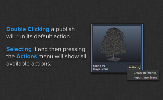
If you select a Shot or Asset Folder object instead of a publish, there will be options to show that item in ShotGrid or in the File system.
Working with older publishes
If you open up the right hand side detail pane, you will see all the version history for your selected publish. This makes it possible to load in an older version. If this is desirable, simply select it in the version history and use its action menu to load it in, just like the publishes in the main view.
Associated review
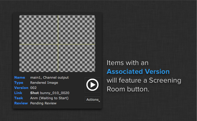
If a publish has an associated review version, you will see a play button appearing in the detail pane. Clicking this will launch Screening Room in a web page, allowing you to quickly see or add notes to the version, as well as playing back the associated review Quicktime.
Advanced functionality
All of ShotGrid’s integrations are built on top of a highly customizable and extensible platform for building pipelines called Toolkit. For more information on how to access and configure this functionality, see our Admin Guide .
Acknowledgments
- A bug fix version of PySide is distributed with ShotGrid Desktop and is available here .
- Big Buck Bunny - footage courtesy of (CC) Blender Foundation, www.blender.org
Tell the doc gen system that we don’t want a header by adding this special markup: TANK_NO_HEADER